Vara’s Safety Net
Improving AI visibility & increasing trust.
Case Study
Breast Cancer Screening, Redefined
Vara’s AI classifies mammograms into one of three categories: "normal" (AI is confident there are no suspicious signs), "no classification" (AI is not confident about a classification), or "Safety Net" (AI is confident that it is highly suspicious).
Through user data analysis, we found out that the Safety Net’s perceived value was lower because at times, cancers that the Safety Net finds are already also found by the readers thus leading to low visibility of the Safety Net.
My Role
Improve AI visibility and increase trust in the algorithm
Redesign the Safety Net UI
Collaborate with the ML & data team to find a technically sound solution
Takeaways
01. User research goes a long way
02. Thinking outside the box
01.
User research goes a long way
Making sense of the data
Our team collected and analysed user data over a period of 3 months. We found that the safety net was not visible around 30% of the times it had detected something suspicious because the radiologists had already found the suspicious finding. This lowered the perceived value of the safety net for our users.
How might we increase the perceived value of the Safety Net for our radiologists? The Product and ML team came up with different solutions which went through several rounds of user testing.
Option 1: Display Safety Net from the start
An easy solution would have been to display the Safety Net from the start of the workflow. So as soon the radiologist opens the study, they could see the marker.

Pros
Increase in efficiency.
Transparency leading to more trust
Cons
Might create bias.
Radiologist may over-rely on the Safety Net.
Option 2: A sign of agreement

We thought of adding a tag to the finding that read “Safety Net agrees” which was a non-intrusive way of displaying information from the algorithm. However, we eventually shelved this idea because it would be inaccurate as our algorithm may not be 100% within the same range as the reader’s marked region.
Pros
Non-intrusive
Radiologist remains unbiased
Cons
May be inaccurate
Radiologist may find it annoying
Option 3: Displaying the Safety Net right after a radiologist adds their finding
As soon as the radiologist clicked to add their finding, the Safety Net would also display without any additional modals or notifications.

Pros
Non-intrusive
Radiologist remains unbiased
Cons
Radiologist might miss it entirely
Option 4: Keyboard shortcut
The final option would use a keyboard shortcut, like the letter “S” to display the Safety Net at any point during the read.

Pros
Non-intrusive
Radiologist remains unbiased
Cons
Additional friction slows down the radiologist
Might still create over reliance on the algorithm
In the end, Option 3 was selected because it had minimum chances of creating over reliance on the algorithm, it was non-intrusive, so it did not interrupt the workflow, and most importantly it addressed our issue of Safety Net’s visibility.
The video below shows the micro-interaction in action.
02.
Thinking outside the box
Evolving shapes
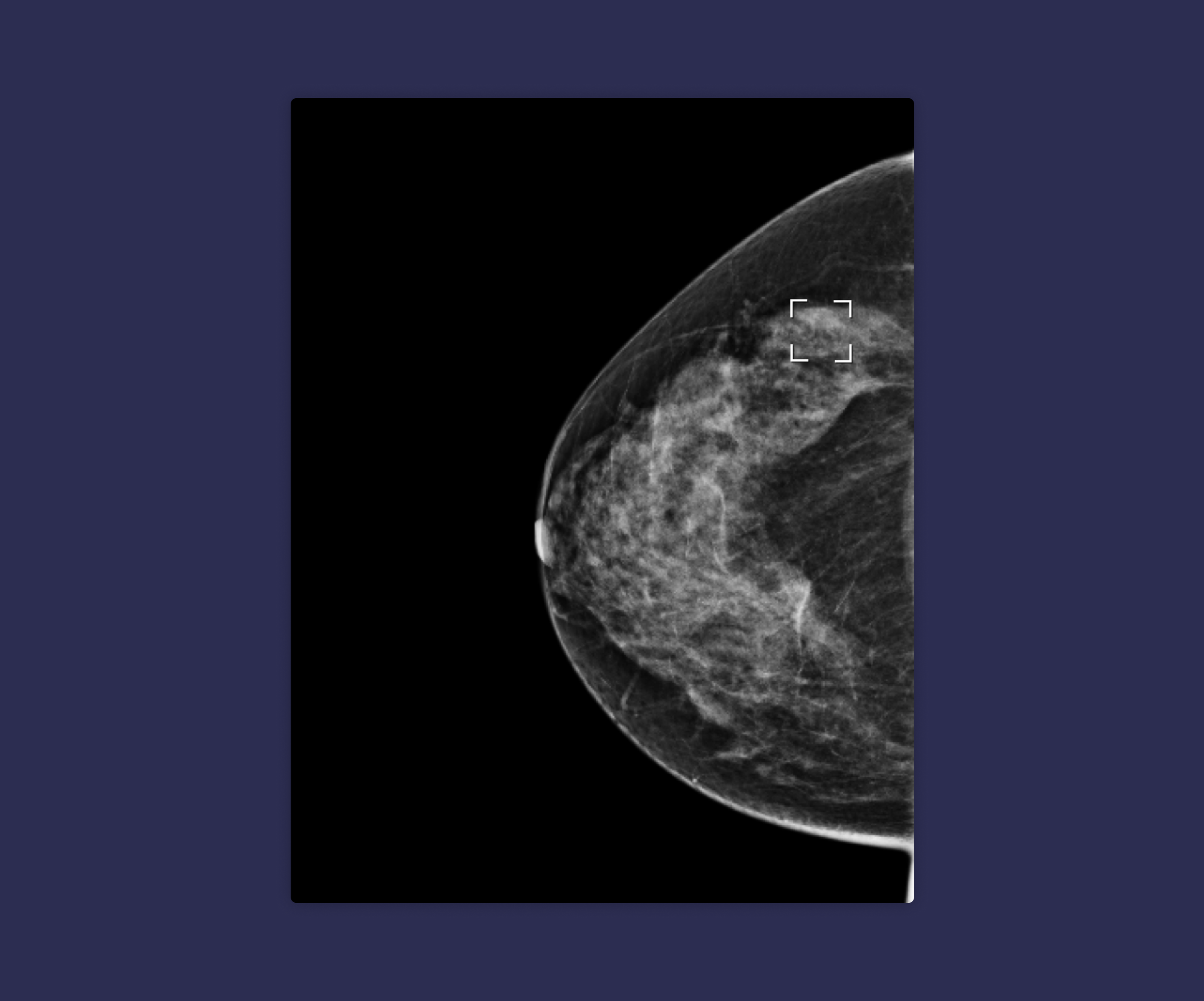
During usability tests and observation sessions we found out that our radiologists were struggling with the Safety Net shape. It was in the form of a cross-hair to separate itself from the circular shape of the findings that radiologists marked around findings and also to be unique from other types of Computer-Aided Detection tools in the market.
The cross-hair was a unique way to mark a finding. However, it failed in usability because it covered the finding and hindered radiologists from clearly seeing what was most important.
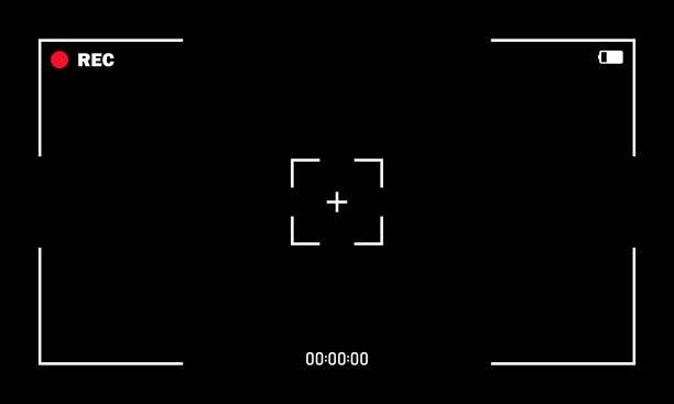
As designers, we must use the world around us for inspiration. Here, I referred to the camera’s viewfinder overlay for the Safety Net’s new shape inspiration.

The new quadrant shape met all our requirements:
It did not cover the finding.
It did not circumscribe a finding, thus leaving some room for error.
It was unique and did not feel like an existing solution.
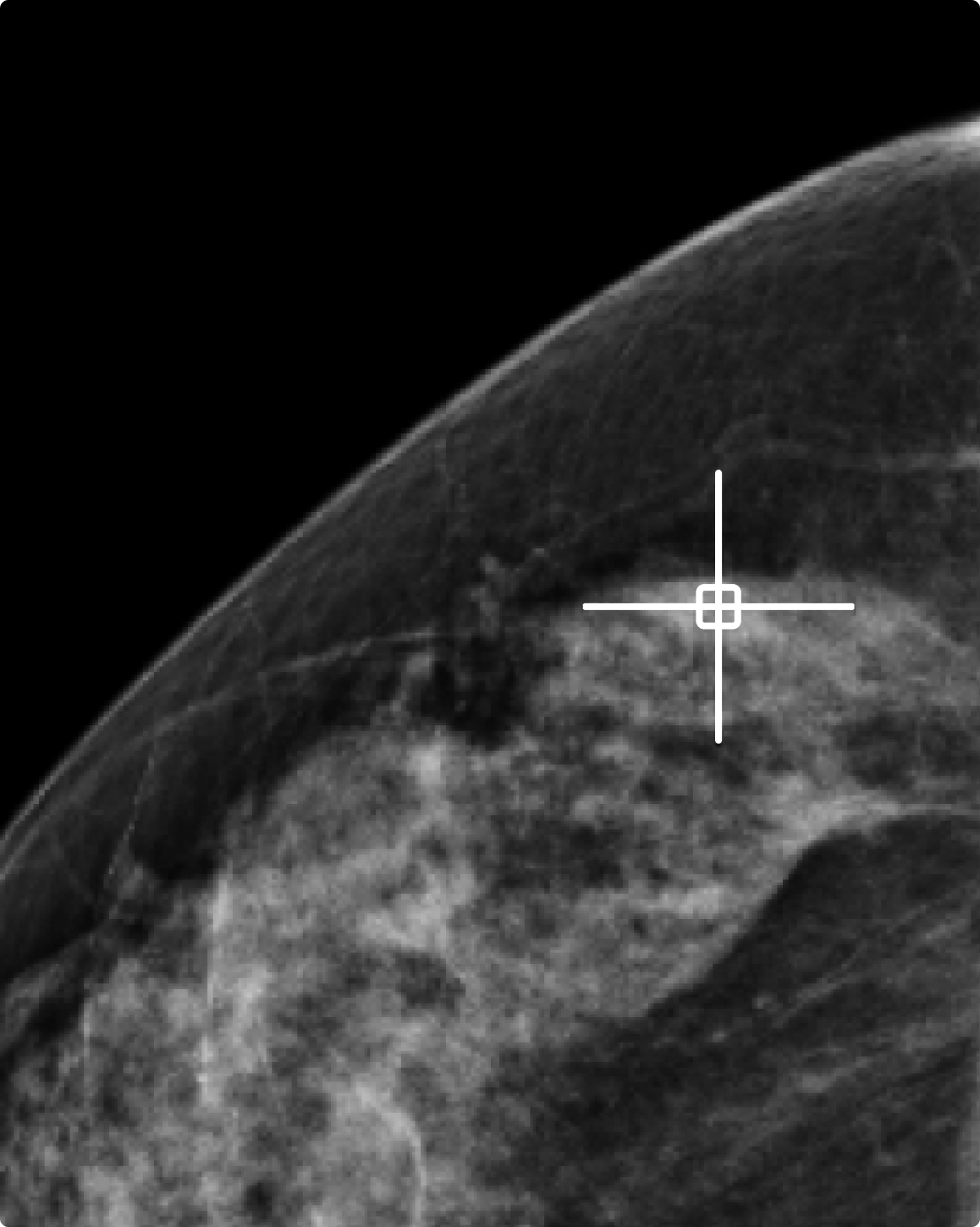
Through an iterative process, we were able to increase Vara’s Safety Net visibility by 30%. Now radiologists could see the marker even after they had found something suspicious within a study. Our assumption was that this would increase trust on the algorithm without creating bias.
There were still issues to be addressed:
Radiologists might learn to rely on the Safety Net (more than currently, as the Safety Net is more visible) with a potential decrease of sensitivity
Safety net could be wrong, and actually perceived performance could get worse when we show more
However, the team is working hard to address the above and the AI-human interaction is a constantly evolving one, making it a very interesting challenge for product design..