Case Study
Sanzu’s Webapps
Connecting mental healthcare professionals to people.

Accessible mental healthcare
Sanzu’s platform is meant for both mental healthcare providers and their clients. They streamline this journey by removing barriers to finding better care — easy access to to a catalog of need-specific therapists, an option to choose between face-to-face or online, and an option to have the first session free of charge.
My Role
Product & stakeholder management
Designing the end-to-end treater and client experience
Setting up a framework for testing the initial hypothesis
Takeaways
01. What is an MVP? Defining and refining ideas.
02. Small steps to understand user needs — to make it easy for users to book appointments.
03. To mobile or not to mobile?
01.
What is an MVP? Defining and refining ideas.
Signup Flow
Defining and redefining what an MVP was meant aligning business goals with technical feasibility. This didn’t always go as planned but in the end we came up with a product that worked and offered a small set of features that set in motion the first steps of the company which came to be the “MVP”.
An essential but underestimated part of the MVP was the signup flow for the treaters. Before the product launched, we already had treaters using an older version of the product that wasn’t linked to the new database. The signups needed to happen from scratch which meant manually getting all of their information either through a form or by phone. This was extremely cumbersome and we hadn’t anticipated how much the signup flow was really needed.


Availability calendar

The availability setting for a treater turned out to be extremely complex to set up. A lot of nuances needed to be anticipated (eg. and the logic needed to be developed from scratch. In short: despite development challenges this was an absolutely core functionality.
02.
Small steps to understand user needs — to make it easy for users to book appointments.
Information discovery

At the time of releasing the MVP we did not have enough information on what exactly it was that the clients wanted to see on their homepage. Since the app was free for the clients, we decided to follow an iterative, low-cost approach by placing information that we could reliably link to and vouch for and then track user-interaction and engagement thereon. The prerequisites were that this needed to scale in the future.
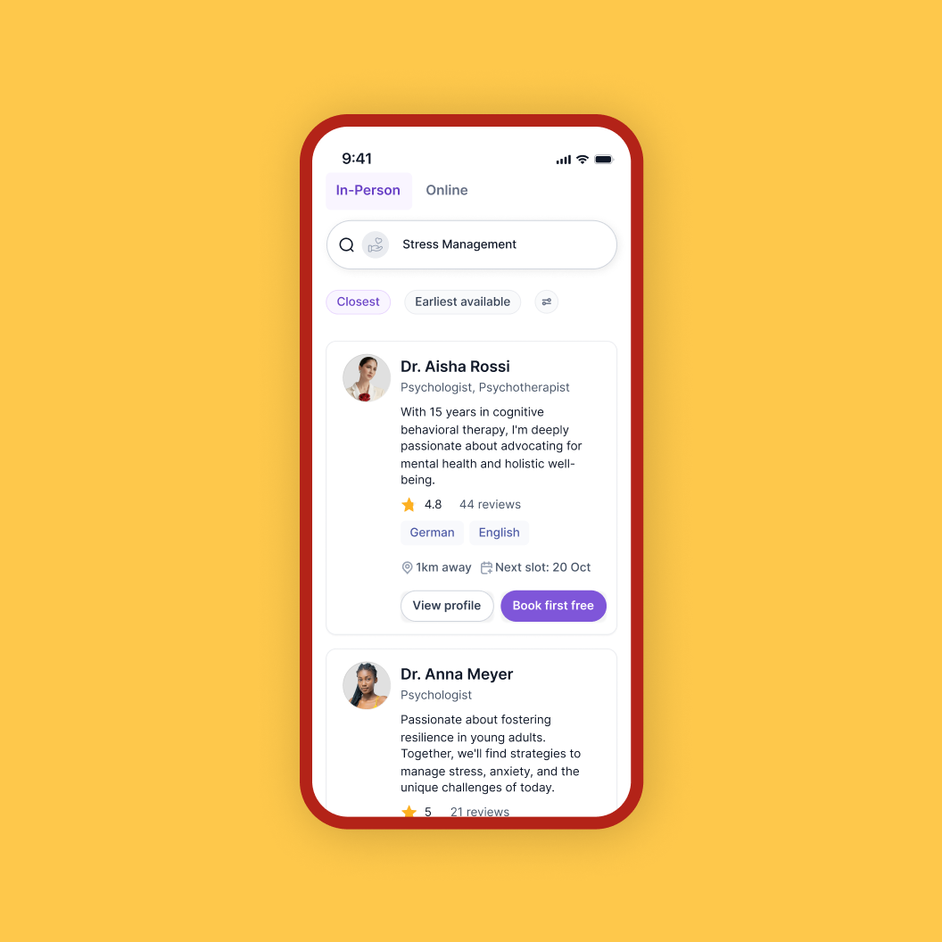
Unified search
There are many ways to finding a match for a therapist. There’s the Tinder approach of swiping until you meet your match. There’s also the surprise approach, where you fill out certain details and are then matched based on the preferences you mentioned. We decided to go for an approach where you’re able to use a search bar to type in a keyword (eg. depression, anger), or a treater’s name or category (eg. Psychologist, coach), and you’ll find the relevant results. We also showed our entire directory of treaters to enable people to be able to have a choice in who they wanted to talk to.
We also had some treater offering the first session free so the view all treaters turned out to be a great approach for it.
This was a first step to getting people to interact with the app such that we could gather more insight into what they were really looking out for when looking for therapy. Was it useful to have all treaters visible or was this overwhelming? Did people know what they wanted? The idea behind this format was to find out more.
03.
To mobile or not to mobile?
The initial hypothesis for Sanzu was that everything would be mobile-first and we’d go from there. Driving a lot of our decisions for this project were resources and time. In the end, we were two people designing and developing two apps from scratch. Which modality should we choose? What information do we have to be certain of our choices?
We spoke to friends and family and the treaters we had on board. The result was contrary to the hypothesis a Webapp seemed like a more acceptable choice for therapy. Sure, mobile was a nice-to-have but given the flexibility of developing a Webapp, we went with it and decided to make it responsive such that it would soon after launch be mobile friendly too.

A lot of learnings came out of this project. Managing a project of this size and keeping timelines turned out to be a huge part of my role outside of just design. We shipped the product in a span of two months right before Christmas 2023 which was incredible given that, both, the backend and frontend needed to be set up from scratch by ONE DEVELOPER.
While we’re very proud of the work we did, there are a bunch of improvements that already come to mind.
The decision to match treaters to clients in the way that we did, while a good one for the time being, can definitely be thought about some more.
The strategy for B2C could be rethought entirely to B2B and the app could cater only to its treaters who would then use the platform to get their clients onboard.
While we managed to ship the product in two months, such timelines should be reconsidered if one is also to account for some user testing and feedback.
There are a whole lot of features that were thought about and are now in development such as document sharing and note-taking which I’ll add next.