Sanzu’s Branding
Designing an early-stage startup’s launch website.
Case Study
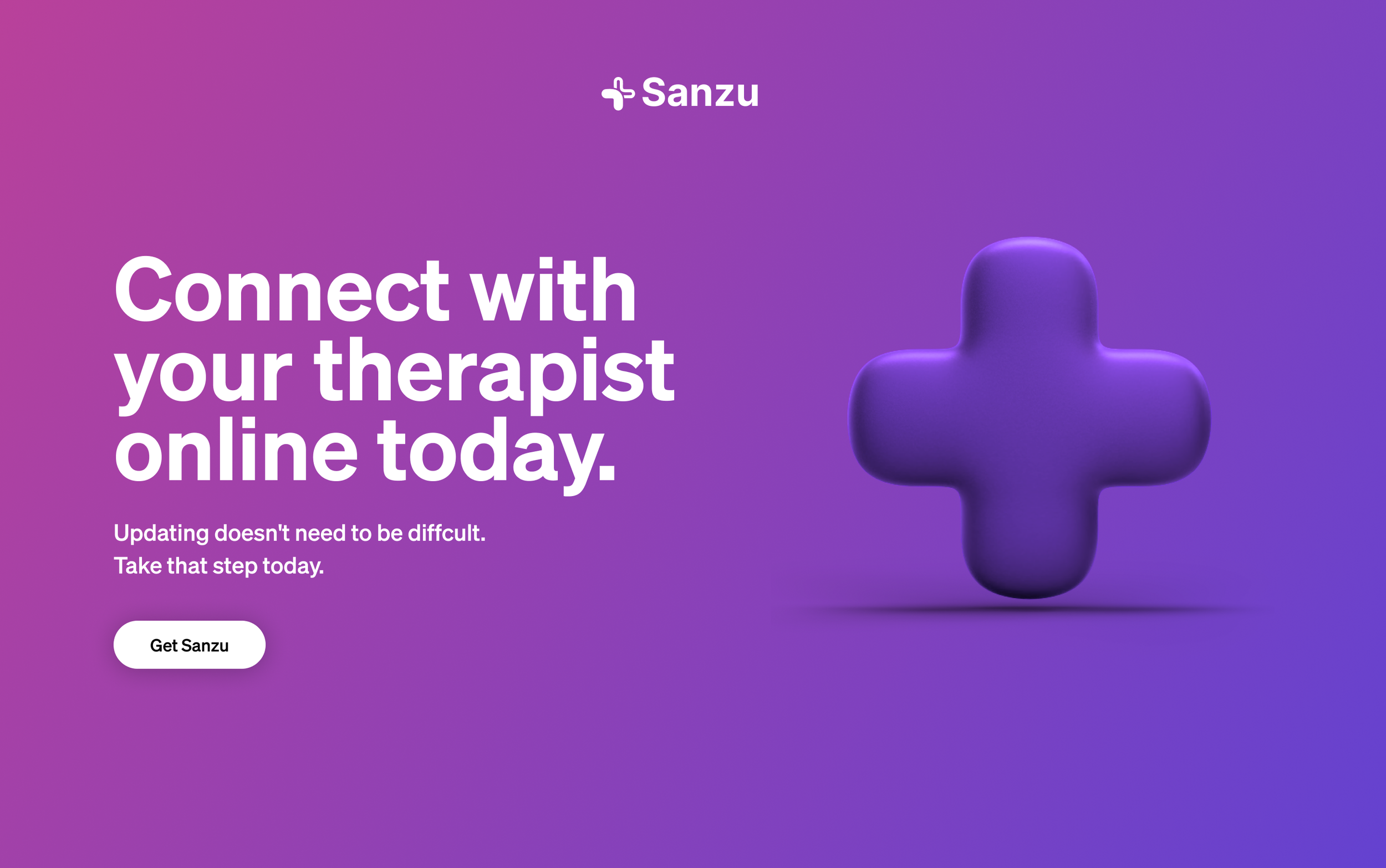
Updating the healthcare journey
Sanzu is a healthcare startup in Switzerland that supports the network that patients and their caregivers form with each other by providing the tools needed to update the patient experience and modernise the patient journey. From booking appointments and tracking progress, to communicating concerns and remote monitoring, with Sanzu, patients and caregivers are able to focus on what matters most - getting better.
Sanzu needed a website to launch their business which aligned with their product and helped convey the most important messages.
Brand placement
Website design
Project management
My Role
Establishing the brand personality
We conducted a discovery workshop and then aligned on the brand personality. This was an important starting point to establish the framework of the website. Did we want to sound friendly or serious? What sort of imagery best represented the brand?
Curious, innovators, ill, worried, impatient, conservative, rational, business minded, empathetic, sympathetic, hopeful, empathetic, encouraging, all in this together, guiding, sympathetic, mildly defiant, empowering, reassuring.
Keywords
Some key words that we distilled together based on the workshop and several discussions on what we wanted to convey through the website.

Focusing on the most important problems and patient and treater goals
Through talking to Sanzu’s team and exploring their user research, we think that more and more treaters want a simplified solution to find and connect with patients and manage appointments which is why we wanted to, through Sanzu’s website, help them achieve this more easily.
Design that reflects “mild defiance”
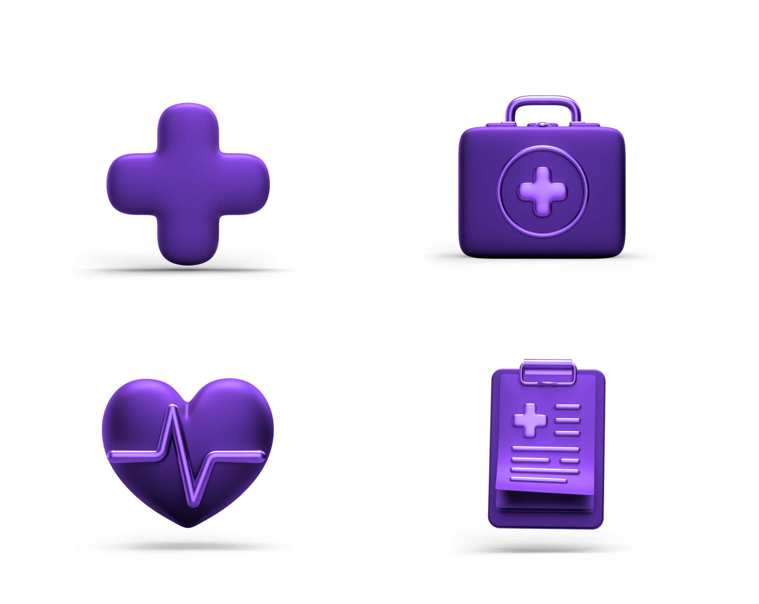
The keywords we distilled from our workshop and user research led to a design system that was clean, modern, and “mildly defiant”. The frosted glass UI combined with the bright and light gradients were meant to establish a modern yet approachable healthcare brand.

Why mildly defiant? Because we wanted to break away from traditional healthcare and through design, really show how Sanzu can simplify the patient-treater journey.
After several iterations but an overall an efficient process, we were able to ship the first version of Sanzu’s website. The videos contain some highlights and changes like removing the 3d icons as they didn’t fit into the visual narrative anymore.
Redesigning the next version
We’re in the process of redesigning the website now that Sanzu is ready to launch their product. There have been several learnings from observing user data, talking to the people visiting the website, and also understanding the updated business objectives.
The floating menu, while it looks great, is not sustainable, given the business will expand and add more items to the navigation.
Right now, patients and treaters are merged but in the future, there needs to be a distinct separation between the two.
While carousels are a nice way to display images, product images need to be laid out differently in order for users to interact with them.
Mobile-first is not always the case. We noticed that our users are actually using desktop more than mobile.
Sanzu’s project was a great example in collaborative work and how business and design can work in a mutually beneficial way. I got a lot of insights from Mike (the founder) which I was then able to translate into the designs I produced for the website. We were aligned on the process and always kept users at the centre of everything we produced.