Case Study
Collegify’s Course Builder
Building a frictionless e-learning experience.
The Future of Education
Collegify’s e-learning platform helps students prepare for entrance examinations such as SAT and ACT by optimising their learning experience through streamlining preparation content, and gathering and visualising data for results.
My Role
Redefine information architecture
Create first interactive platform for teachers
Build a design-system
Takeaways
01. Simplify the journey and give control to the actual user
02. Small details, big difference
03. Design for usability
01.
Simplify the journey & hand the controls to the actual user
Course Dashboard
Teachers provided content to the backend team, who would then update it onto the system which was an additional step. Through a separate course dashboard, teachers can directly upload course content for their students to learn from.
Teachers can now create courses under which they could add modules, edit permissions, add a course plan, give exam instructions, configure essays, and manage the publish status independently.


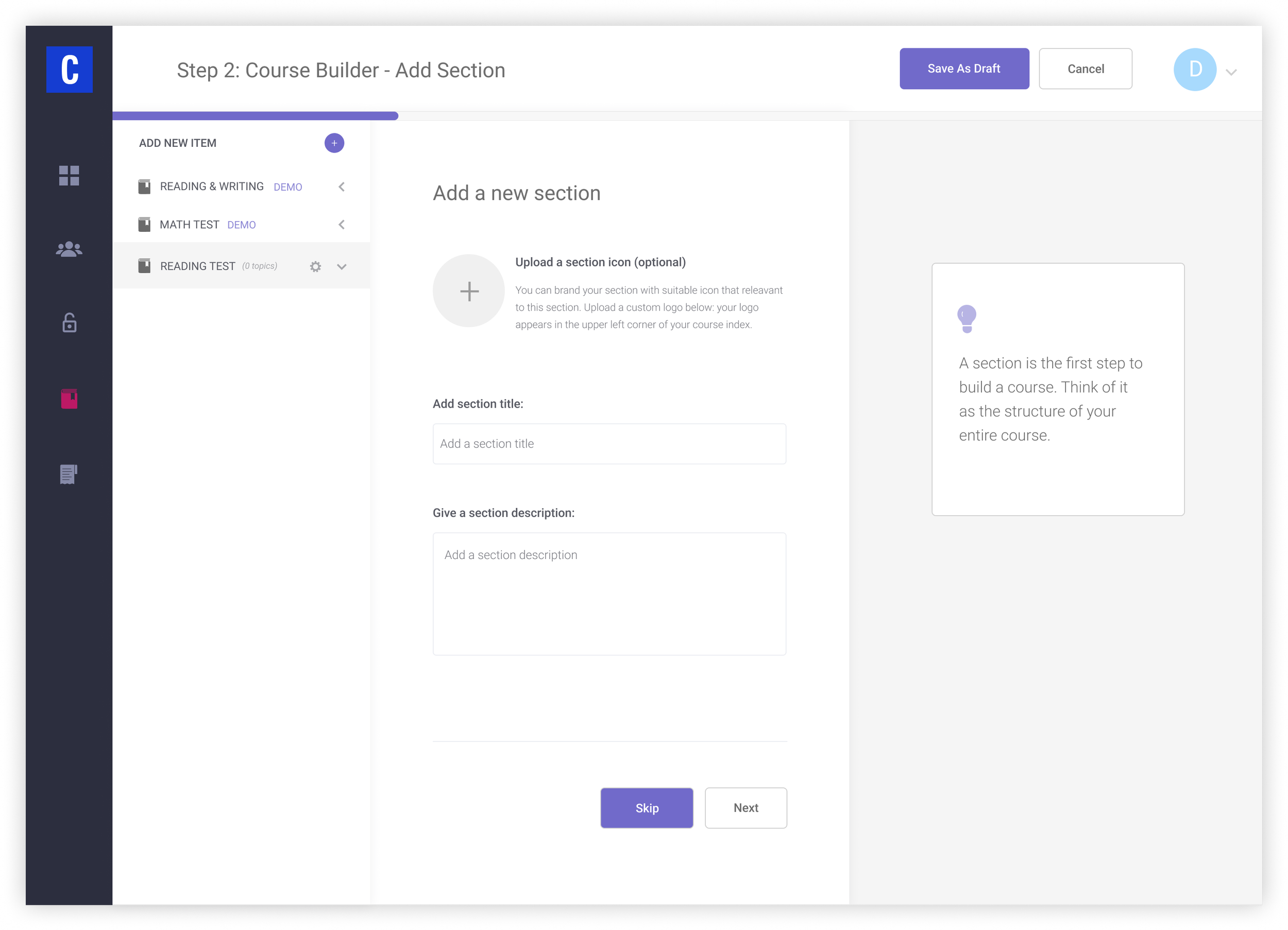
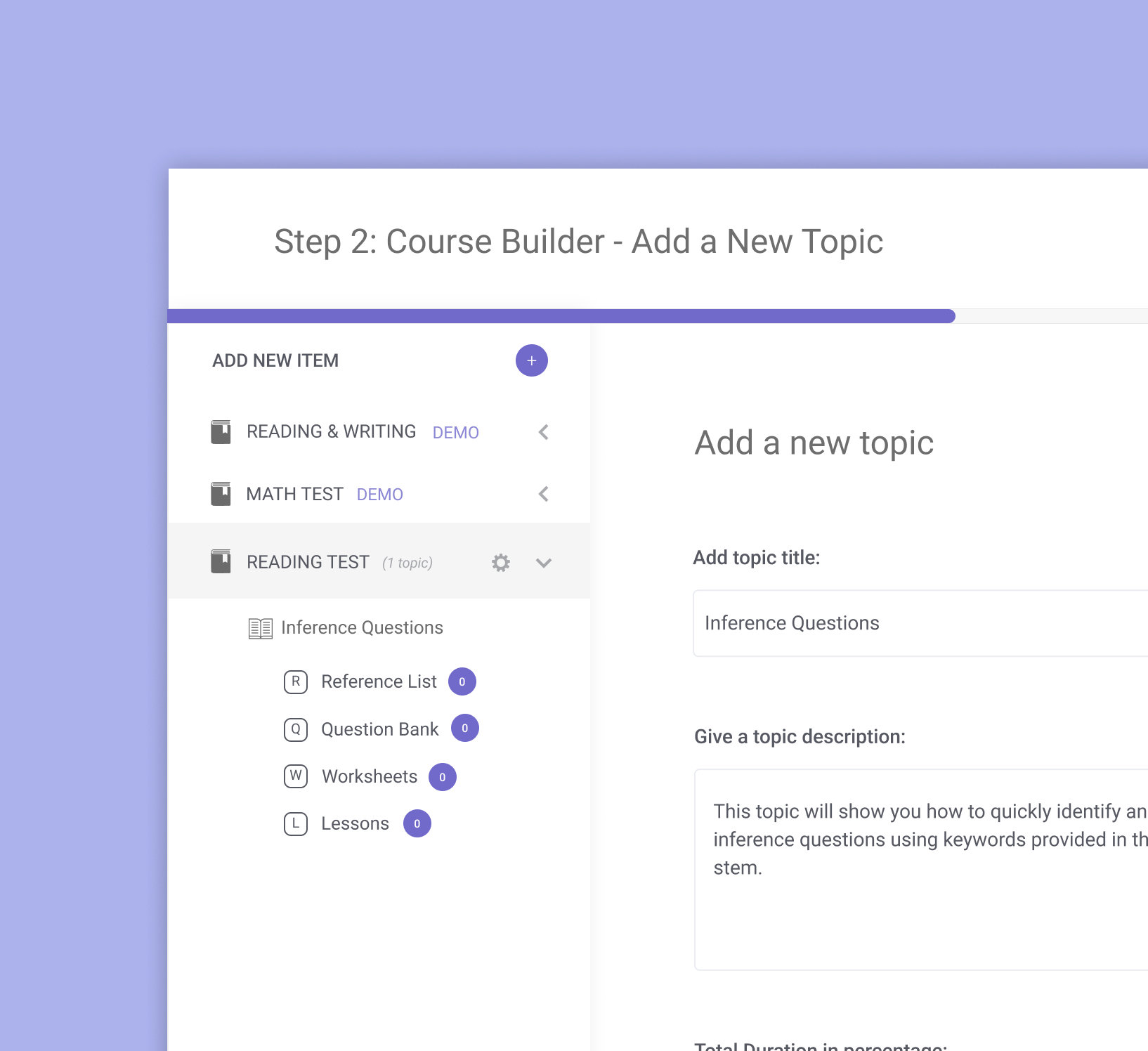
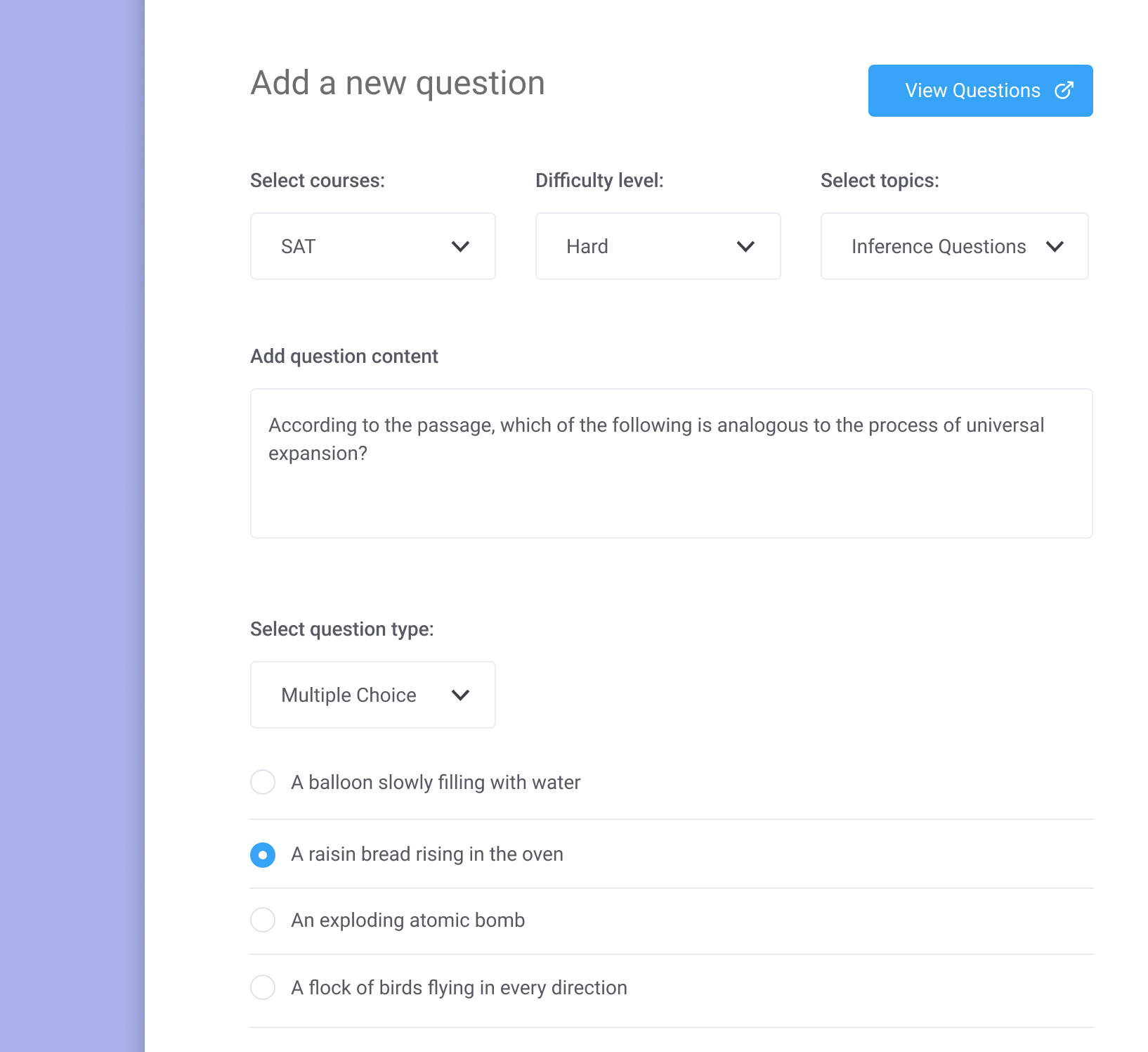
Course Builder
A step-by-step builder was conceived to allow teachers to build courses and add modules like examinations, diagnostic tests, and weekly quizzes. This reduces the burden on the backend developers, reduces the time teachers spent sending documents of course content to developers, and also gives them complete accessibility to define and edit their courses as per their students’ needs.

02.
Small details, big difference
Prompts for navigation
Teachers are guided through filling out course content via prompts on the right-hand side of the screen. The prompt serve as a helpful line of text summarising what they need to do on the page. This is especially useful for first-time users.

Google Suite Style “Review History”
The team was a big fan of the Google Suite review history feature so we used it as an inspiration to build it into our Course Builder in order to see who has edited what and when.

Progress Bar Indicator
A simple progress bar indicates the progress the teacher has made in building their course. This helps users understand where they are within the process and how much more time it will take.

03.
Design for Usability
A scalable design-system
A new design system helped to create a separation between the Collegify student platform and teacher platform. The system consisted of reusable components, predefined colours for different states, buttons, typographical hierarchy, and icons, which saved development time. The goal of the design system was to add consistency across the whole platform which it managed to achieve.
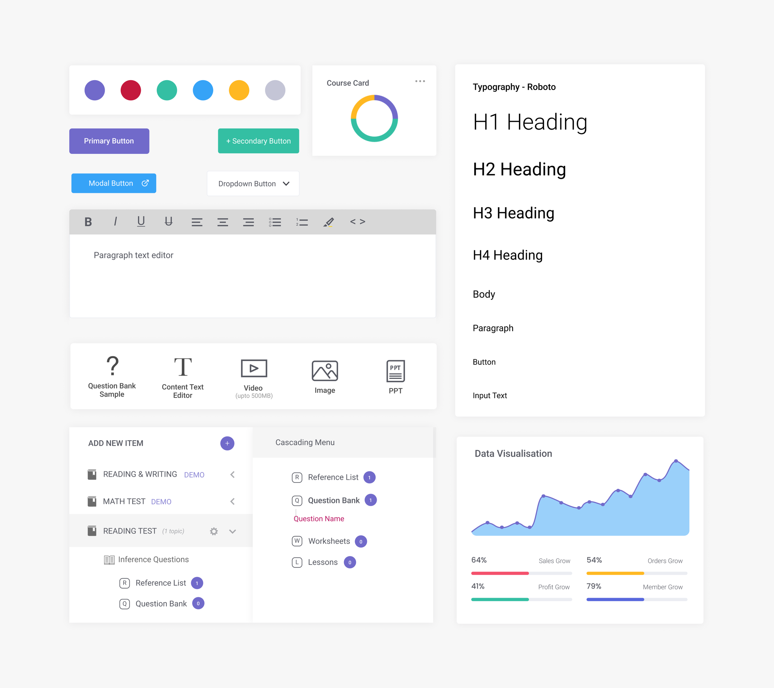
An icon library was built to indicate hierarchy and consistency within the platform.
Collegify’s course builder platform went through a lot of changes since. To sum up the project, it was a great starting point for the team and they benefitted from the human-centered design methodology.
One of my key learnings during the project was the strength in collaboration. The product was complex and navigating it required daily syncs with the developers to validate my design assumptions.
Another learning was that despite designing a scalable design-system, the feedback was that it would have been better to use an existing framework to reduce development time even further.